
The Design Rules Hidden Inside Nostalgic Objects
A cassette, a camera, and a paper zine carry more than a period look. Their constraints can give contemporary design a stronger point of view.
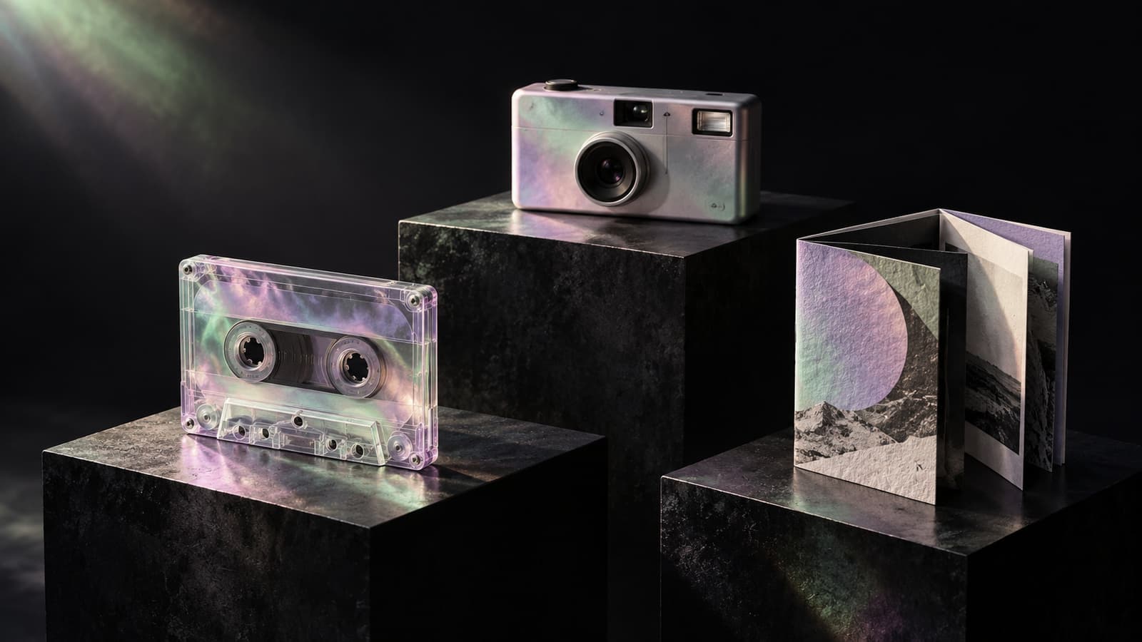
A cassette tape is an object with a beginning, an end, and an inconvenient journey between them. That makes it a more interesting design reference than its familiar rectangular silhouette suggests.
The same is true of a film camera or a folded zine. Each carries a way of paying attention. The camera asks for a choice before the result appears. The zine turns a limited sheet into a sequence. The tape gives a collection of tracks an order that somebody had to commit to.
This essay makes a creative argument, rather than a prediction about what consumers will buy: nostalgia becomes more useful when designers borrow those organizing ideas instead of applying a period surface to a contemporary product.
The ritual gives the object meaning
The least interesting use of a cassette is often a picture of a cassette. The more interesting question is what someone did with it.
They selected songs, worked around a fixed duration, and decided which track should follow another. They made something for a particular person. They listened again. A graphic built around repetition, sequencing, or a ribbon escaping its orderly housing can express that activity without reproducing a specific album or artist's identity.
This gives the designer several decisions to make before choosing a color. Is the work about patience, collecting, anticipation, discovery, or sharing? What should the viewer recognize immediately? What should become apparent only after another look? An object can carry the answers, but it should not have to invent them on its own.
The difference shows in the final image. A reference object used as decoration sits on top of an idea. A reference object chosen for its behavior helps structure the idea.
Build rules that survive a change of subject
A collection is a particularly good test. If every piece needs the same cassette to feel related, the visual system may depend too heavily on one recognizable prop.
Try replacing it with a popcorn carton, an arcade token, or a folded page. The family resemblance should survive through other choices: the weight of the contour, the proportion of quiet space to detail, a recurring relationship between colors, the way lettering anchors the composition, or a consistent kind of visual exaggeration.
Those rules can be precise without making every image alike. One object might explode upward while another forms a compact silhouette. A third might be built from a diagonal gesture. Shared treatment lets each subject keep its own character.
For AI-assisted illustration, that is also a practical brief. Describing the common rules separately from the individual scene makes inconsistencies easier to notice. A convincing individual image can still be the wrong member of the collection.
Use texture to explain a material
Distress is easy to add and easy to overuse. A field of scratches can make a clean composition look older without giving the viewer any reason to care about its age.
A more deliberate approach gives each texture a job. Engraved lines can describe the curvature of a record. Solid dots can turn a shadow into a printable graphic field. Paper edges can make a folded form legible. Wear can draw attention to the part of an object that gets handled.
Once texture has a role, it becomes possible to remove some of it. The picture no longer needs every surface to shout the same message. Its most important marks become easier to see.
There is a useful counterfactual here: imagine the image without its grain. Does the idea still read? If the answer is yes, texture can enrich the work. If the answer is no, the composition may be relying on atmosphere to do the work of a subject.
Leave the reference room to change
Nostalgia does not require the fictional world to obey the original object's limitations. A record can become a planet. A television can contain an aquarium. A paper publication can unfold into a bird.
The transformation works when the original form remains recognizable enough to support the surprise. The viewer needs an ordinary thing to encounter before it becomes extraordinary. Too little change produces a catalog illustration; too much change removes the point of reference.
This is an editorial judgment, not a formula. The productive tension is between recognition and invention. The designer decides which features are structural and which are available for play.
A reference should open a direction
A useful studio exercise is to name the value before naming the era. Make a project about replay, limited choices, anticipation, or independent publishing. Then decide whether an older object is the clearest carrier of that value.
Sometimes the best outcome will look unmistakably retro. Sometimes the historical starting point will disappear, leaving only a stronger rhythm or a better sequence. Both are valid results.
That freedom matters. It gives nostalgia a future-facing role: an archive of alternative ways to organize attention. The goal is a visual language with enough structure to support new subjects, and enough personality to make a familiar object feel newly alive.
Cover: AI-generated editorial illustration.